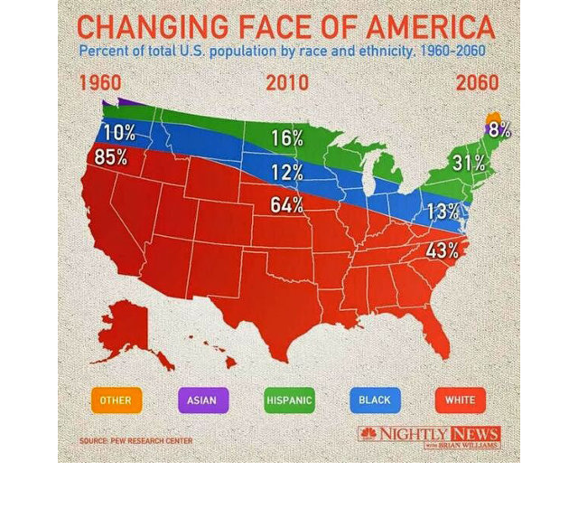
In a column called
Design Crime over at Fast Company's Co. Design page they've found a map-based infographic produced by NBC Nightly News that they're calling "The Worst Infographic Of 2014 (So Far)". From their review:
In short, just by changing the context of the original infographic, NBC Nightly News turned what was a straightforward visualization of America's demographics over time into some sort of alt-history map of 100 years of ethnic cleansing and racial segregation. Oh, and there's time travel in there for some reason too.
No comments:
Post a Comment